BVN Stories — February 9, 2017
Empower the individual - BHP Workplace
BVN Practice Director, Kellie Newman was recently interviewed for "The Inside Story 480 Queen" by BHP Billiton, the following is an extract from the publication relating to the new BHP headquarters located at 480 Queen Street, Brisbane.
Why were you interested in partnering with BHP Billiton on this project?
We were instantly drawn to this project as we understood it to be a highly significant project for BHP Billiton. We appreciated that the expectations would be very high and that BHP Billiton would challenge us to create a global benchmark workplace.
It is opportunities such as this that we relish. We wanted to truly engage with BHP Billiton, to peel back and discover the workings of an organization and then synthesize how to enhance and translate this knowledge into a transformative work environment.
We also wanted to extend our knowledge of the site context, the building and its design strategies into the interior realm. As the architects for 480 Queen we wanted to apply our deep understanding and intuitive awareness of the building to the BHP Billiton project.
The ability to seamlessly translate this through to the design thinking for the interior workplace would bring to the project an enhanced outcome and intrinsically unite both the building and the workplace together.
What was your brief?
BHP Billiton’s high level brief for the project was to consolidate three separate office locations into a single building and provide consistently high quality accommodation for your people - in line with BHP Billiton’s position as an industry leader.
The overarching strategy was to ensure productivity and efficiency. Other key drivers focused on generational diversity, health and wellbeing, innovation and technology. The space should empower the individual and allow one to be the best they can be. It was also essential that we created a workspace current and relevant to market conditions but at the same time prepare for the future and the unknown.
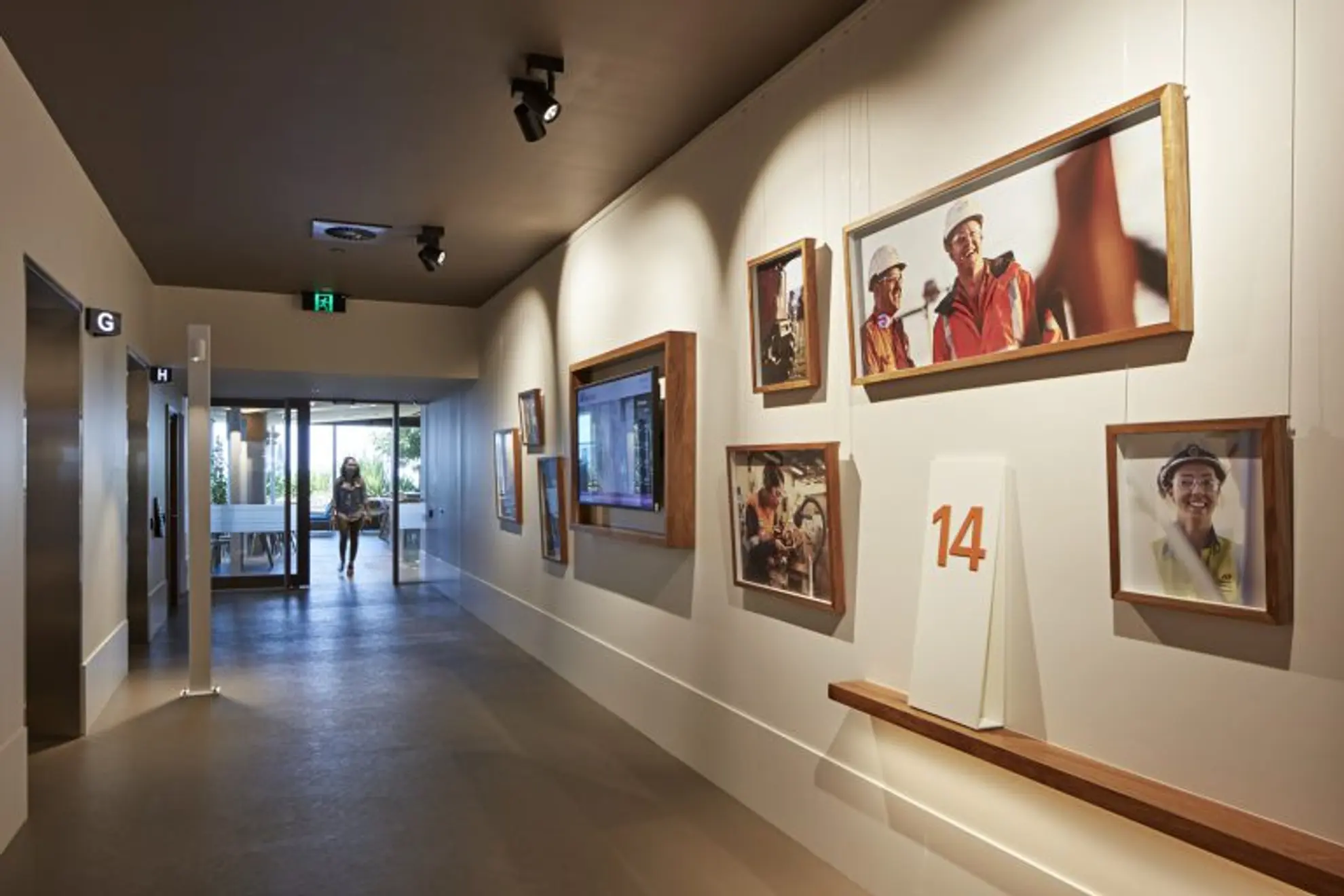
As we engaged further in the strategic thinking and brief phase, we discovered the importance of creating a strong ‘connection to site’. Although the space would be home to the corporate offices, there was priority to create a meaningful connection to the various sites that make up BHP Billiton’s coal operations. The purpose was not to create an ivory tower, however to create a space that truly connects to the business at the ground level.

Can you describe the design process?
The design and delivery of the project was undertaken in the following phases:
- Strategic Thinking and Brief
- Concept Design
- Design Development
- Contract Documentation
- Contract Administration
The initial phases commenced with establishing the high-level strategy of the project. Once the big moves were determined, we set the design principles to describe the personality and character for the workplace.
As we interrogated various planning options across all levels we developed key spaces such as reception, cribs, terrace, shared spaces, stairs and voids. Ideas as to how these spaces look and feel and the material palette began to further create the identity of the workplace. As the plans were determined, we gradually moved into a deep level of detail around the functionality of every aspect.

Our design approach was an open dialogue with the Project Team and we invited the team into our studio on a weekly basis for informal pin up sessions and discussions. This high level of engagement enabled the planning and design to evolve with contributions from the entire team.
Kellie Newman, BVN Practice Director
Where did you find inspiration?
Our design concept for BHP Billiton’s workplace is built around a narrative which connects the corporate office to your operations in Queensland and New South Wales. This ‘connection to site’ sits at the very centre of the character of the workplace. Your operations are at the core of your business and we wanted to ensure your site- based people feel comfortable and welcome within the corporate workplace. We wished to evoke the senses and play with subtle mining analogies to give meaning and greater depth to the workplace. This has been portrayed in three main ways:
1. Folding plane ceiling

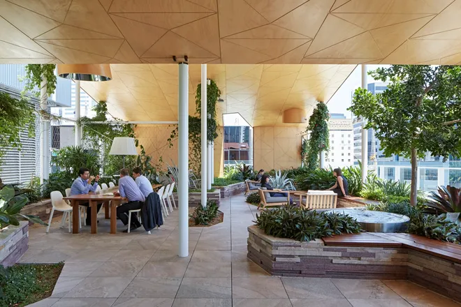
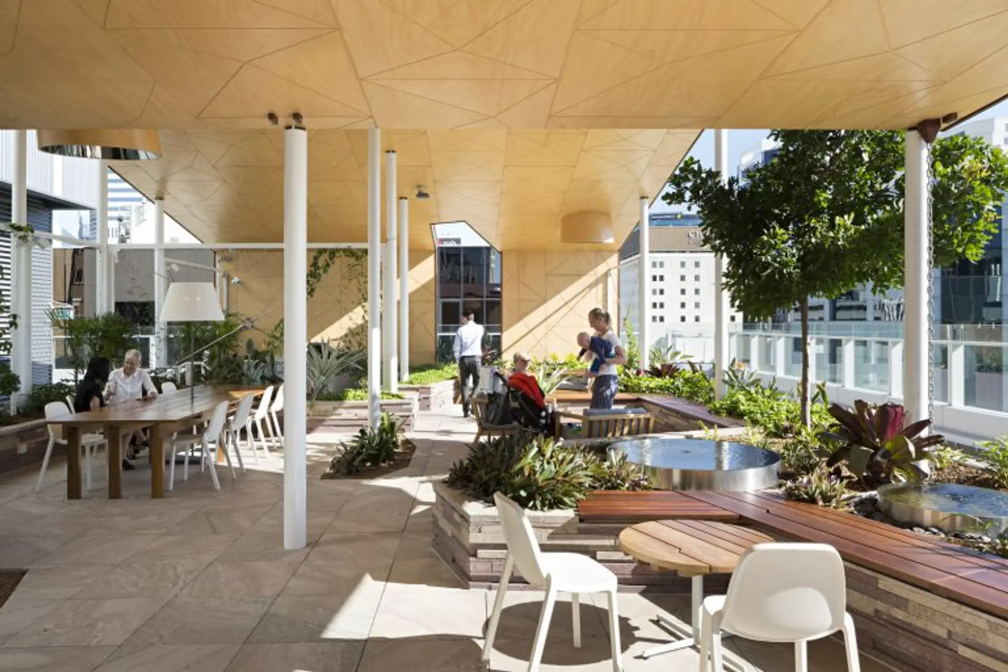
This is reminiscent of a simple canopy tent-like structure seen in an open landscape. A place where everyone comes to gather and share a meal and stories of the day. This ceiling is located at both the Queen and Adelaide edges of the ‘cribs’. The folding plane ceiling is a common character of all these spaces including the outdoor terrace. The ceiling is positioned directly in line with the building structure to enable the highest possible ceiling. Services have been limited to the ceiling where possible and up lighting is used to highlight the dramatic shape and the beauty in the natural cork surface. Rooms that sit under the folding plane ceiling are solid to a certain height - with glass above to capture the true expanse of the ceiling passing though each space.
2. Rooms as buildings

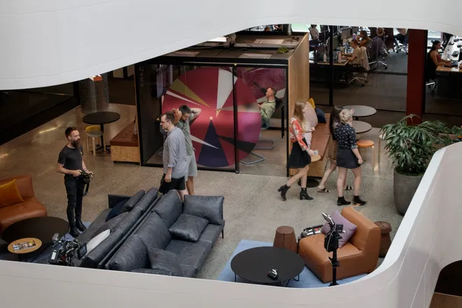
To create a sense of being outside, the rooms have been considered as buildings that sit within the context of site. The ceilings around the buildings are heightened with shape and form introduced through recessed bulkheads. Particular attention has been placed on the openings to the buildings, the scale is lower and more domestic, the material is a natural timber and the glazing is in the form of both window boxes and walls that align with the lower door height. The window boxes, doors and signage to the rooms protrude beyond the wall surface to provide variation to the space. Privacy to the buildings occur on the north-south axis that aligns with the workspace, with solid walls, window boxes and timber framed glass doors.
Transparency to the buildings occur on the east-west axis that aligns with the street and laneways, with glazed walls and solid timber doors. Consideration to how the occupants feel within the buildings has been given high priority. The attention to detail is placed at the level of the occupants seated at the table. The quality of the table is of utmost importance with a solid timber edge and furniture linoleum insert, the tonal character of the carpet wraps up the walls to the datum height of the table top. The acoustic panels and timber shelf that help to ground the screen on the wall all align with the table. These considered pieces help to create a sense of quality and warmth to the inside of the buildings.
3. Materials palette

The palette evokes materials and finishes that could be found in the natural landscape. It is simple and not over complicated and is consistently reinforced on each of the levels. The natural earth tone to the street is continuous throughout and highlighted only by a change to the softer carpeted areas of the building and workspaces. There are three palettes to the rooms, a bronze, deep green and a rust colour which help group the rooms together within their building context.
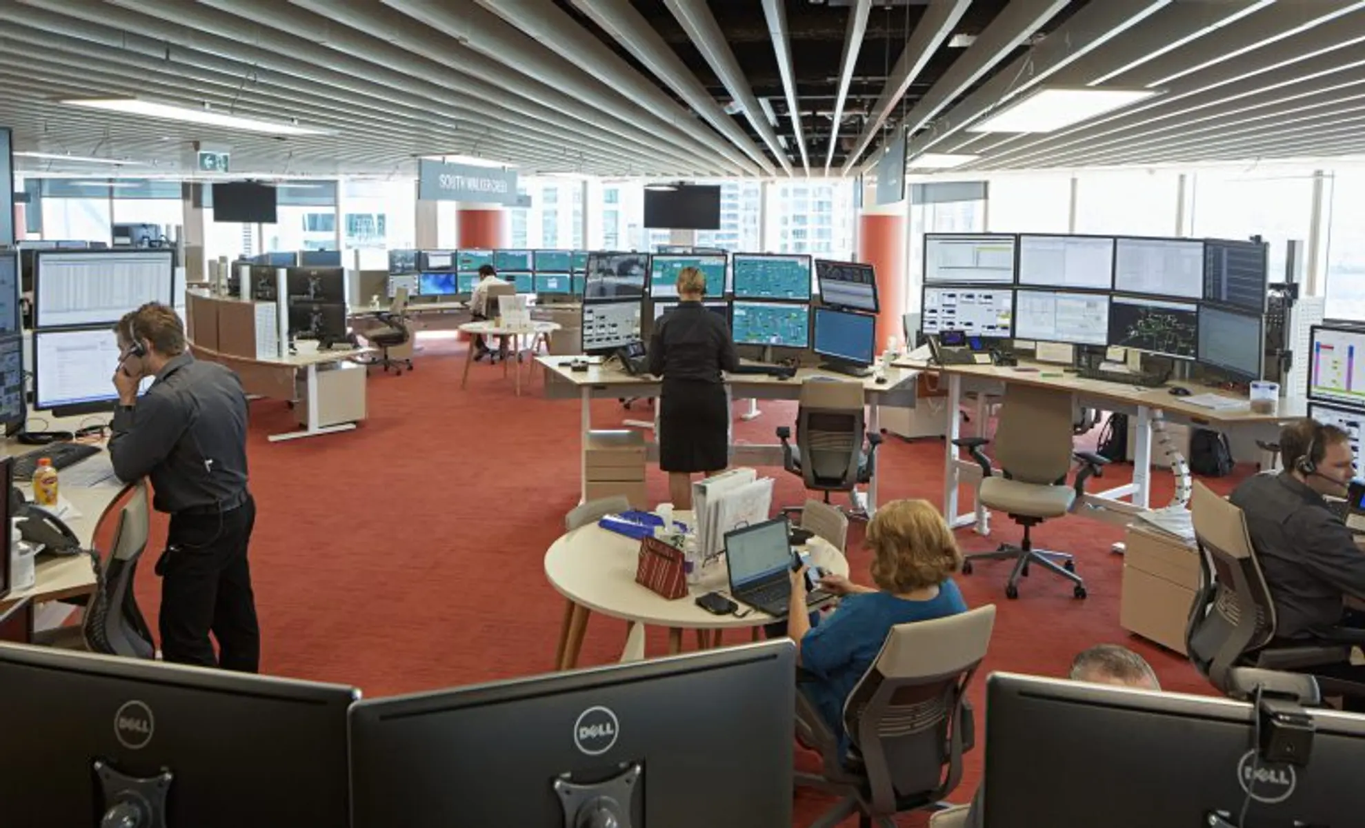
To give the workspace a character of its own, cues have been taken from the red earth landscape - as shown in the carpet and columns. The remainder of the palette is a warm beige with timber highlights. To enhance the earthy tones, we have deliberately limited the use of whites and blacks throughout the space. The Tasmanian Blackwood timber and the Australian marble used for the ‘cribs’ and reception benches bring a sense of quality and durability to the space and are utilised at low level areas so everyone can engage with the beauty of this material.
Shared spaces explained:

The Adelaide Street cribs - featuring fully equipped kitchens - provide a place to relax, eat and prepare food, whereas the Queen Street cribs provide tea and coffee facilities and open, informal meeting spaces. The finishes are derived from the street palette and include accent colours to add vibrancy and create a common link between the floors.

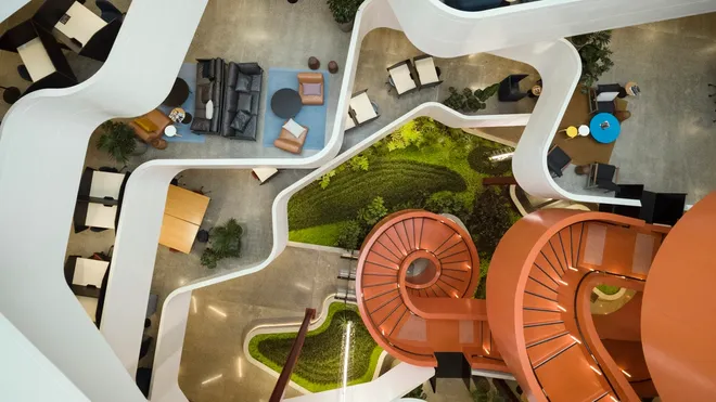
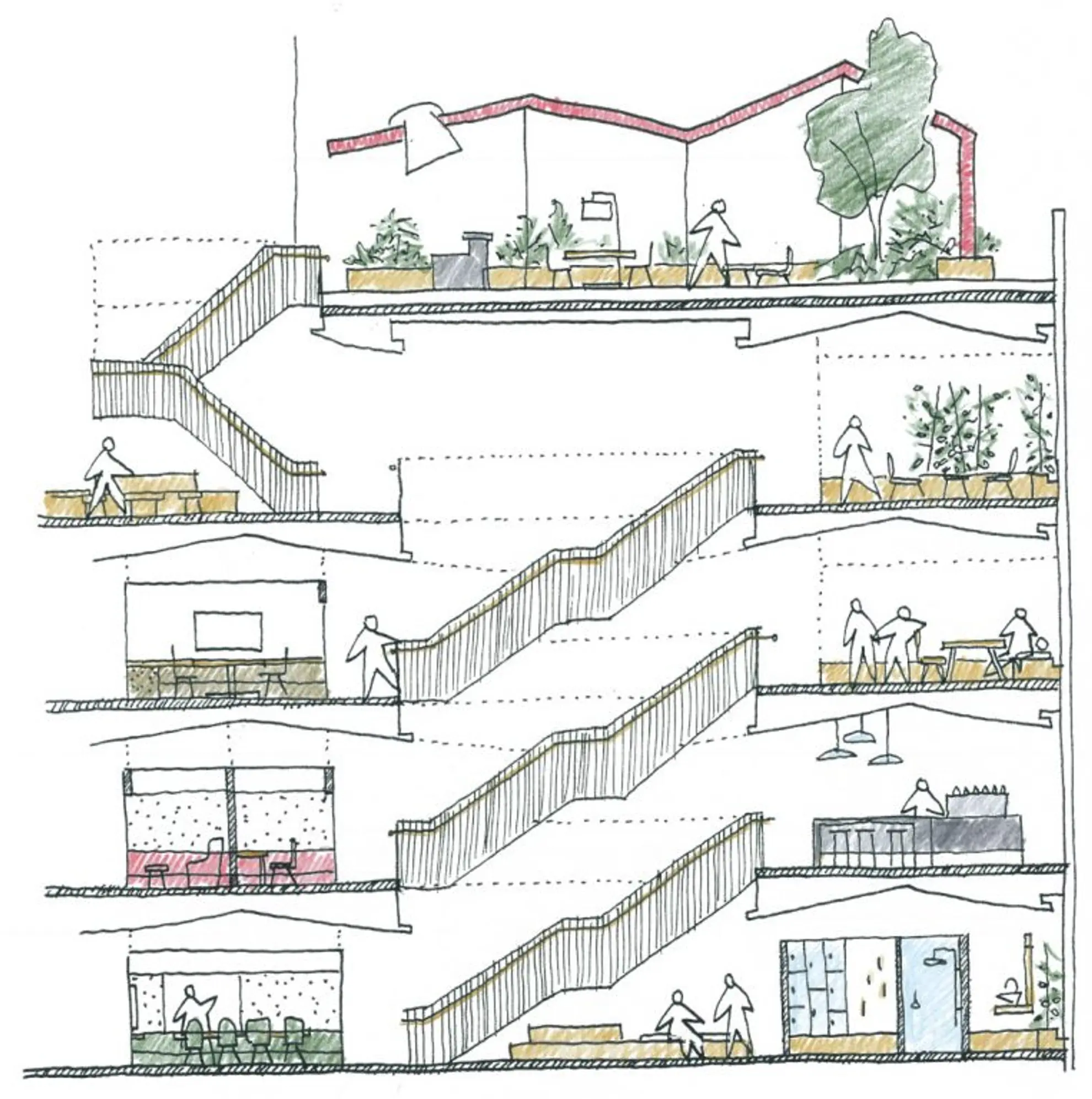
The zoning of the campus floor plate is divided into ‘public’ and ‘private’ spaces which are assembled around a ‘shared street’. A series of built space ‘villages’ within the public zone are planned within a hierarchy of streets and lanes. The private space is the quieter open-plan workspace which is connected via the Adelaide Street axis. The main vertical street connects the Adelaide and Queen Street cribs which act as destinations with visibility from the lift core. The void, created by the internal stairs, is in a linear arrangement on the Adelaide Street edge of the floor plate in order to facilitate another wide street, connecting the open-plan workspaces and encourage circulation through this zone.

Informal, open collaboration spaces are situated around the internal stairs to create a buffer and provide gradual separation before people move into the open workspace. The planning concept locates all of the built space in the ‘shared zone’, which aims to provide maximum flexibility for expansion and contraction as required. The modular ‘kit of parts’ approach to the built spaces supports longevity in design and sustainability as required over time.

A modular approach has been applied to quiet booths, quiet rooms, and the various sized meeting rooms. The size and shape remains constant between the floors with multiple furniture arrangements available to support a mix and variety of meeting types, suiting individual and group requirements.
What principles guided your decision making?
Key design principles are paramount to a successful project. Without these, it is very difficult to create an outcome with a coherent and strong idea. As many people contribute to the project and are making numerous decisions daily, the key design principles guide the decision making process. From the engineer designing the ventilation system, to the designer selecting a door handle, each decision is measured from the design principles.
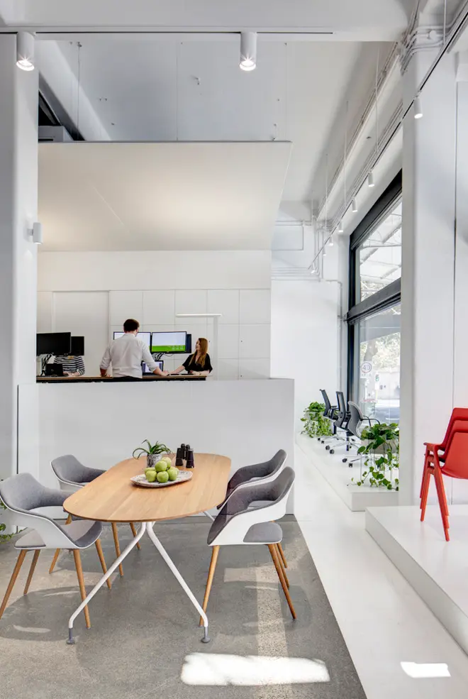
Every experience occurs at 1:1 scale, part of the challenge of a large floor plate is creating an environment which is comfortable to occupy. We do this by breaking up the floor plan into habitable spaces, using domestic scales for detailing and visual cues to humanise the built environment. This is particularly evident in the design of the door, window boxes and joinery. The scale and heights of the cribs’ joinery is remnant of the home kitchen.
An opportunity often missed in open plan offices is the building edge. Generally uninviting without some form of embellishment, the facade is often neglected. By the addition of a timber sill to the crib spaces we now feel comfortable to sit close to the facade edge and enjoy the sun, natural light and view of the City.
Lack of stimulation for humans can lead to fatigue. Large floor plates in particular risk creating a monotonous environment. With this in mind, simply changing lighting and finishes between spaces can achieve variation and prompt changes in behaviour. There are three variations in experience which create this contrast; the workspaces, the cribs and the meeting/quiet rooms. This gives people a varied experience at numerous points of the day as they interact with the different spaces.
Domestic tactility
Our perception of a space is governed by more than the selection of finishes. Deliberate use of colour and tactility can be used to give hierarchy and order to a scheme. The tactility used is quite subtle within the spaces and is often highlighted by the type of lighting that occurs within the space. The number of materials and tones are quite restrained, however the intensity occurs when they are placed together.
Fashion is a common temptation in a fit-out scheme, often invisible at the time. The greater the attraction, the quicker a scheme will date. Natural materials are largely resistant to the frivolity of other materials and convey an enduring quality and warmth. Tasmanian Blackwood timber is the hero finish - with the majority of the timber being of a solid material. The beauty in the variation of this timber will only intensify over time.
Understanding the purpose of a space innately without the need for explanation. This occurs through careful resolution of the built environment and selection of task oriented furniture. The ‘high street’ from Adelaide to Queen Street provides a strong physical and visual connection with links to laneways from and to the workspace. The Adelaide edge of the building engages with the Cathedral whereas the Queen edge engages with the River. These characters help you navigate where you are in the building.
In your view, what were the most successful aspects of the interior design?
I think the success lies in how the space makes you feel. It has a welcoming, warm embrace and makes you feel comfortable as soon as you enter. There is a quality of the space that is modest without being ostentatious. The lighting is soft and varied and does not feel like you are in a typical relentless office building. The materials are warm and natural however there are also contrasts and variation.
There is also a strong sense of clarity when navigating the space. It is easy to understand where you are in the building.
The terrace on Level 14 is a memorable part of the workplace and is truly unique to BHP Billiton. It provides a myriad of opportunities for all to use from gatherings, meeting, eating, socialising, working and even just a space to move outside and clear your head and get some fresh air.

What has the project meant to you?
I have been working with BHP Billiton and the Project Team since the inception of this project in June 2013. I see its completion as a very important milestone in my career.
The challenge of creating a large workplace project for BHP Billiton is an absolute highlight and working with such a fantastic team has been a pleasure in many ways. It has also provided a wonderful learning and growing experience for me and a number of the team from our BVN studio.
